When I worked for a small company in Japan as an engineer, I designed a new corporate web site. I had some responsibilities as an engineer and web design was not one of my main duties. But I tried my best to make it from designer's viewpoint. Here are some differences between the new and old web sites in terms of overall design, viewpoint, logo, animation, and outcome.
Overall Design
The overall design of the old web site was somehow classical. The width was fixed at 720px, which had been common until several years ago. There was no animation or eye-catching image. It was not easy to find what services the company provided. It looked inactive, and when I found the web site before having a job interview with them, I thought I visited a wrong site.
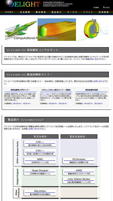
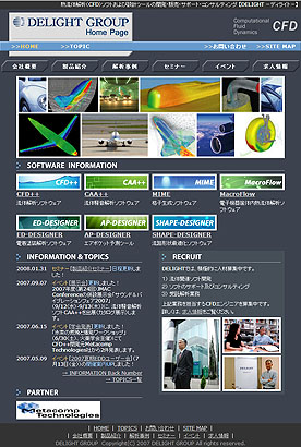
I tried to make the new web site somehow modern looking, but not too modern because the people working there ware very conservative; it should look updated, but should not very different from the reality.
The old web site was exclusively for Japanese visitors though some of the customers are in other countries. I created a bilingual web site and avoided using "Japanglish". For example, "home page" means "web site" in Japanglish, and it appeared on every page of the old web site. I tried to make the new web site understandable as many people as I can.
Viewpoint
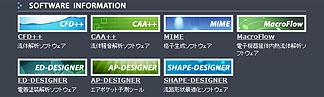
In the old web site, the software products ware randomly arranged under the section titled "Software Information". Every product had a different background image, but there is no relation between the image and the product. In the description of every product, it explained how the product works from developers' viewpoint, which some users understand but some others do not.
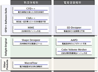
In the new web site, I arranged the products in a matrix; a column represents the field in which the products are used, and a row represents the type of the products. In the description of every product, I tried to explain what users can do with the product from users' viewpoint.
When software developers describe their product, they tend to explain how they created it. Those software products are used in highly-technical fields, and many users care how the products are designed. It makes sense to show how the products are made for those users, but they are not all. I tried to translate developers' words to users' language, whether it is in Japanese or in English.
Logo
Believe or not, the company did not have a logo. The symbol besides the company name in the old web site did not appear anywhere else, and nobody recognized it as a logo. I chose the colour of the new logo based on the visual impression of the products that the company distributed in order to relate the logo to the services. You can probably tell similarities between the logo and the animation below.


I also designed some other 2D media such as brochures and presentations, and used the logo in every media, which had not been common in the company.
Animation
The old web site simply did not include any animation in the 21st century. This animation is not only an eye-catcher but also shows what the company can provide to their customers, in other words, what the customer can do with the products distributed by the company. I used PhotoShop to prepare images and used Flash to make this animation.
Outcome
After the new web site was launched, inquiry actually increased. It no longer looked outdated, and more importantly, it is more searchable than before. Since I was working right there, I could quickly update the information or add new contents as we needed.
This was a tough project. I designed the web site when I worked for this small company as an engineer. My client was my company, or in other words, the president of my company. He is a mathematician, and has absolutely no sense of users' viewpoint. I tried my best to make him understand that the web site should be designed for users. But his focus was only to show how they developed the software, and he does not allow his employees to express their opinion. Probably this was an extreme case.
If I would do a project like this, i.e., redesigning a corporate web site from a different viewpoint, I would have spent more time on discussion on the concept. It should be easier to work toward a common goal.